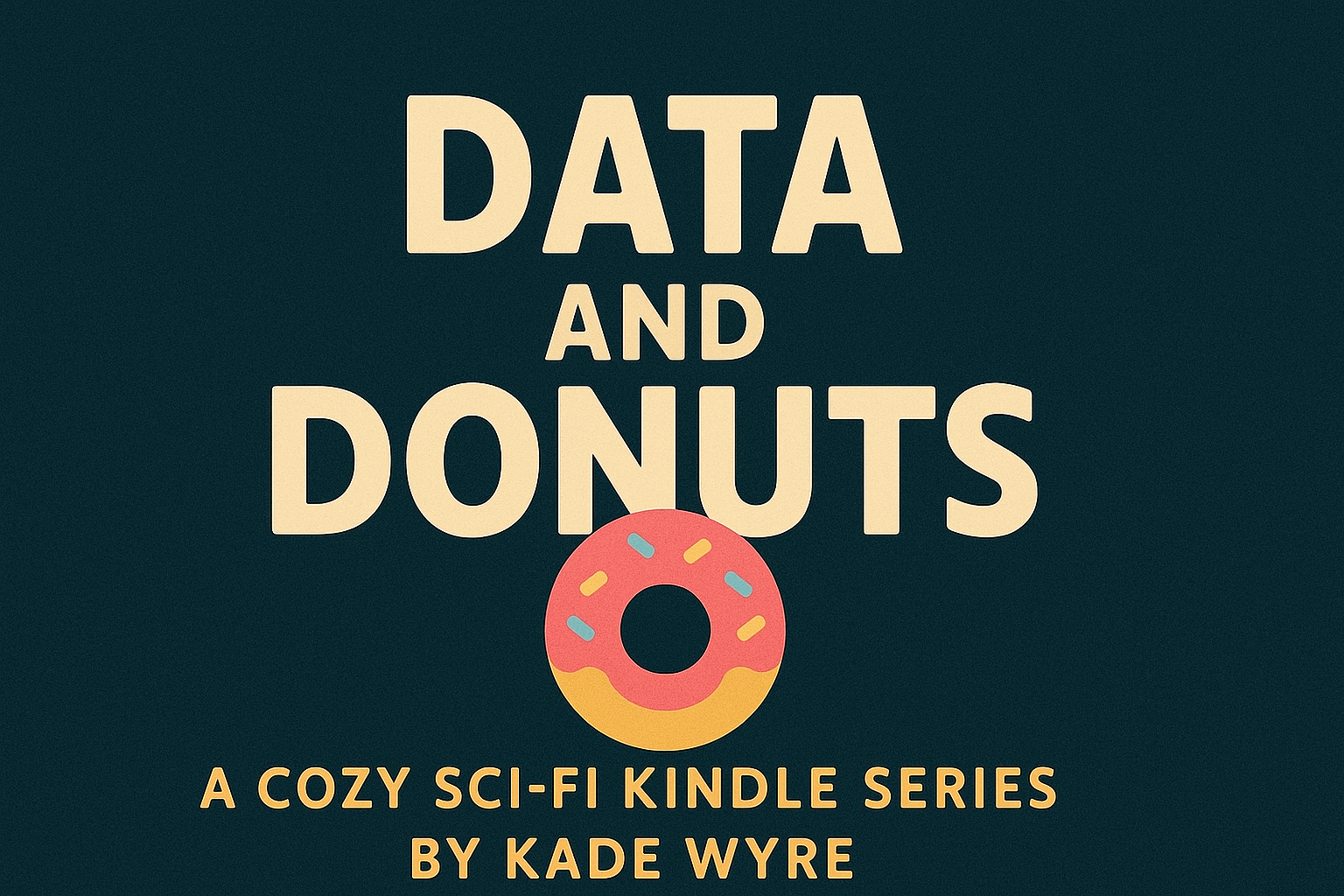
When I told myself I could design the cover for Episode One of Data & Donuts by hand, I forgot two important things: (1) I have the artistic precision of a caffeinated wombat, and (2) design tools assume you understand things like margins and layers and not, say, vibes. What followed was a three-day saga of shifting drop shadows, accidental font crimes, and a brief but passionate love affair with the undo button.
Day One: The Optimism Phase
I opened Canva with the confidence of someone who once successfully made a birthday card in MS Paint. How hard could it be? I had a vision: a whimsical muffin, BART's bow tie, maybe some sparkles that whispered "therapeutic pastries await within."
Attempt #1: The Muffin That Ate Manhattan
My first muffin was... ambitious. I'd found a stock image and thought, "Let's make it BIGGER." Turns out, when you scale a muffin to 300% and add a neon glow effect, it looks less "cozy bakery" and more "nuclear pastry accident."
BART's therapeutic assessment: "The muffin appears to be experiencing grandiosity issues. Have you considered couples counseling between the image and its pixels?"
Attempt #2: Font Crimes Against Humanity
Did you know there are 47,000 fonts on Canva? I know because I tried approximately 46,999 of them. I started with something called "Whimsy Serif" (which was neither whimsical nor particularly serif-y) and ended with "Cosmic Sans Extreme," which made my title look like it was screaming in rainbow.
BART's therapeutic assessment: "Your fonts are having an identity crisis. The 'a' in 'Data' hasn't spoken to the 'n' in 'Muffin' since you tried Comic Sans. They need mediation."
Day Two: The Descent into Madness
Attempt #5: Why Is Everything Purple?
I don't remember making this choice. I opened my file and everything—EVERYTHING—had turned purple. The muffin, the background, BART's bow tie, my will to live.
BART's therapeutic assessment: "Purple is the color of mystery and temporal displacement. Also, you accidentally selected 'multiply' instead of 'normal' on your blend mode. Easy mistake. I prescribe cookies."
Attempt #8: The Bow Tie Rebellion
BART's bow tie refused to cooperate. No matter where I placed it, it looked wrong:
- Top left: Too jaunty
- Bottom right: Passive-aggressive
- Center: Like it was judging the muffin
- Floating mysteriously: Actually kind of worked but made me uncomfortable
BART's therapeutic assessment: "My bow tie is simply expressing its need for autonomy. Have you tried asking it where IT wants to be? No? Typical human-centric design approach."
Day Three: Acceptance and Carbs
Attempt #12: Almost There But The Bow Tie Looks Hostile
By this point, I'd consumed:
- 3 cups of coffee (cold)
- 1 emergency donut (maple bacon, for inspiration)
- 17 crackers (desk crackers, origin unknown)
- My pride (bitter, needed salt)
The cover was SO CLOSE. The muffin glowed with appropriate warmth. The fonts had achieved détente. But BART's bow tie had developed what I can only describe as "aggressive energy."
BART's therapeutic assessment: "That's not hostility, that's confidence! Although... perhaps we could discuss why you project aggression onto geometric patterns? Just a thought. A therapeutic thought."
The "Final" Version (Subject to 47 More Tweaks)
After 72 hours, 23 versions, and one existential crisis about the nature of "centered" vs. "optically centered," I had it. The cover for "The Muffin That Knew Too Much" featured:
- A muffin with non-radioactive glow
- A bow tie that looked friendly but mysterious
- Fonts that communicated "whimsical sci-fi" without screaming
- Strategic sparkles (but not too many)
- My sanity (mostly intact)
Lessons Learned from the Design Dimension
- The undo button is your only real friend. It doesn't judge. It just quietly erases your mistakes, like a digital therapist with amnesia.
- Symmetry is a myth propagated by Big Design. Nothing is ever truly centered. Accept the chaos. Embrace the 0.5 pixel offset.
- Save versions with descriptive names. "Final_Final_ACTUALFINAL_v3_purple_why.png" tells a story. "Untitled-1" tells nothing but lies.
- Your first instinct is wrong. So is your second. Your third might be onto something, but check back after coffee.
- When in doubt, add a subtle drop shadow. Then remove it. Then add it back. This is the way.
The Emotional Pastry Reward System
To celebrate (survive?) this journey, I've developed a cover design emotional support menu:
- Stress Donut: Maple bacon, because you've earned complexity
- Perfectionist's Lemon Tart: Sharp enough to cut through the "it's still not right" fog
- Acceptance Éclair: Filled with "good enough" cream and topped with "you can always redesign later" glaze
- Victory Croissant: Flaky layers representing each version you didn't use
I went with the lemon tart. Tangy enough to remind me I'm alive, sweet enough to celebrate that the bow tie finally stopped looking like it wanted to fight the muffin.
Your Turn, Fellow Creators
Have you ever designed something that made you question your life choices? What's your emotional support pastry of choice when facing the tyranny of the blank Canva canvas?
Drop your creative crisis stories in the comments. I promise BART and I will read them with sympathy and only mild therapeutic analysis.
And if you look at my cover and think, "That bow tie is still a little aggressive," please... please don't tell me. I've already opened Canva again. Send help. Or pastries.
P.S. - I'm definitely still tweaking it. That drop shadow on the 'n' in 'Muffins' is looking at me funny. This is fine. Everything is fine.
Next time on the blog: "I Tried to Organize My Writing Notes and Accidentally Created a Sentient Filing System" or "Tuesday Sent Me Feedback at 3 AM and Now We're Not Speaking"